Sopot—city visual identity
The city of Sopot is unique—at once small and big, peaceful and teaming with life. Nature meets culture, and historical heritage mixes with avant-garde art. Thanks to its location—in the heart of the Trójmiasto agglomeration, on the beach, with natural health salt springs—Sopot is Poland’s most beloved sea resort.
The previous promotional logo, designed in 2005, was not keeping up with the evolution and strategic goals of the city. It didn’t show the strengths and character of the city or its residents. So, after conducting workshops and analysing the needs of the city and the local community, we developed a complex brand identity system for Sopot.

1
The Sopot aura
Sopot is well known for its white, sandy beaches, beautiful sunsets, elegant villas and a lively community of artists and writers.
To reflect the unique Sopot aura, we dug into inspirations from the local landmarks: the molo, the city panorama, the historic villas, verandas and steeples, the sea and the forest. We also went back in time—to the old typographic neon on the molo, post-war posters and illustrations, and the city’s coat of arms. Sopot is much more than a seaside spa and sunny beaches. It’s home to internationally known theatres, galleries and museums; its festivals a destination for artists and writers.

City of culture
A typographic logo, based on classical lettering treatments, will tell the story of cultural Sopot better than a graphic symbol.

2
The classy resort
To meet the needs of the locals, as well as returning Sopot lovers, the new city brand builds an image of an upscale, classy resort—for those, who appreciate relaxing outdoors to absorb the nature, and value a healthy lifestyle and the rich cultural offering and community of the city.
The typography-based logo, which does not introduce a new primary graphical symbol, does not compete with the traditional coat of arms. Rather, it complements it, by using similar fine, linear elements and flowing character. The logo works well alongside the coat of arms on elegant official prints, all the while allowing the city to meet the needs of a vibrant, modern, often digital, communication.
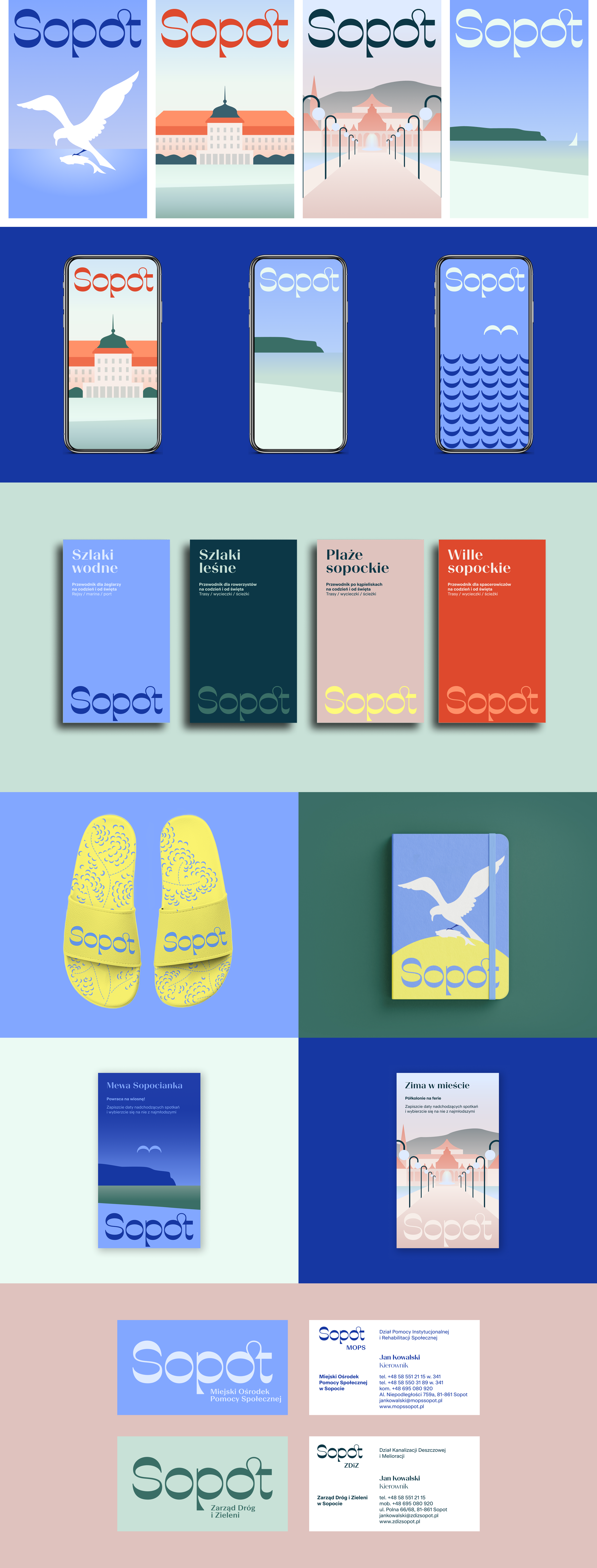
Under the city umbrella
The new identity goes far beyond just a refresh of the city’s visuals. It is an extensive system, which will allow Sopot to communicate more clearly and consistently with its residents. We developed a new brand architecture for the city’s many diverse institutions. The clear and trustworthy Sopot signature and brand identity system will differentiate official Sopot organisations and messages from the onslaught of commercial communication. The logos of Sopot institutions have been designed based on three templates, with room left for each institution’s character and needs. In some cases, previous logos have been retained and only slightly modified, to ensure the continuity of the city’s most recognisable brands, while inviting them all under one common Sopot umbrella.

3
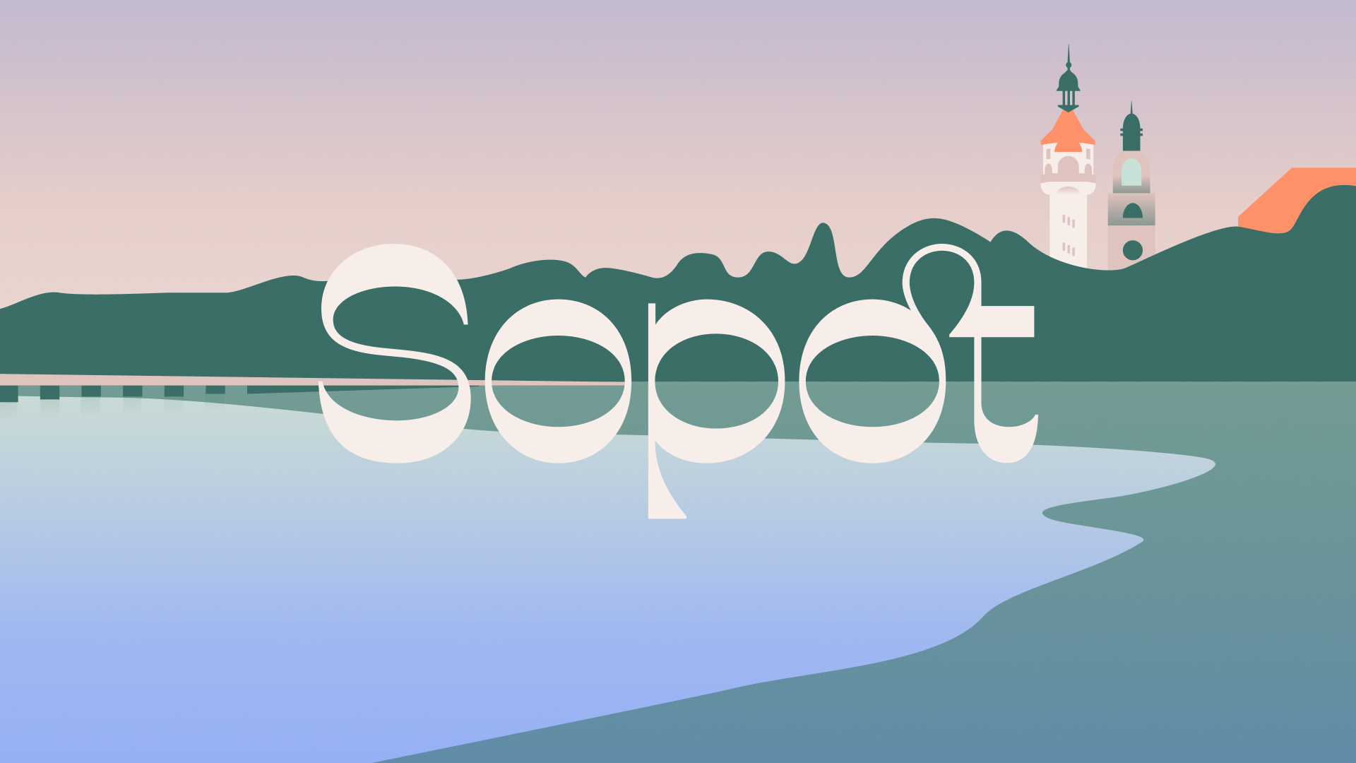
If Sopot were a typface…
The typographic system is based on the Beausite Family (by Fatype Sàrl), which has been modified to fit the needs of the visual identity.
Out of the visual quirks of the logo, and a close partnership with Fatype, a new custom typeface for Sopot was born… and became the star and key element of the visual identity. As a typographic continuation of the logo, it serves as a clear signature of the Sopot style and one of it’s strongest distinguishing features. With its wavy curves, graceful ligatures and retro feel, it conveys the look & feel of Sopot—the city of culture and nature, literature and the sea. It’s worth noting that the font was designed with the Polish language in mind—that’s why the special ligatures are “cz”, “sz” (among other, less frightening ones).

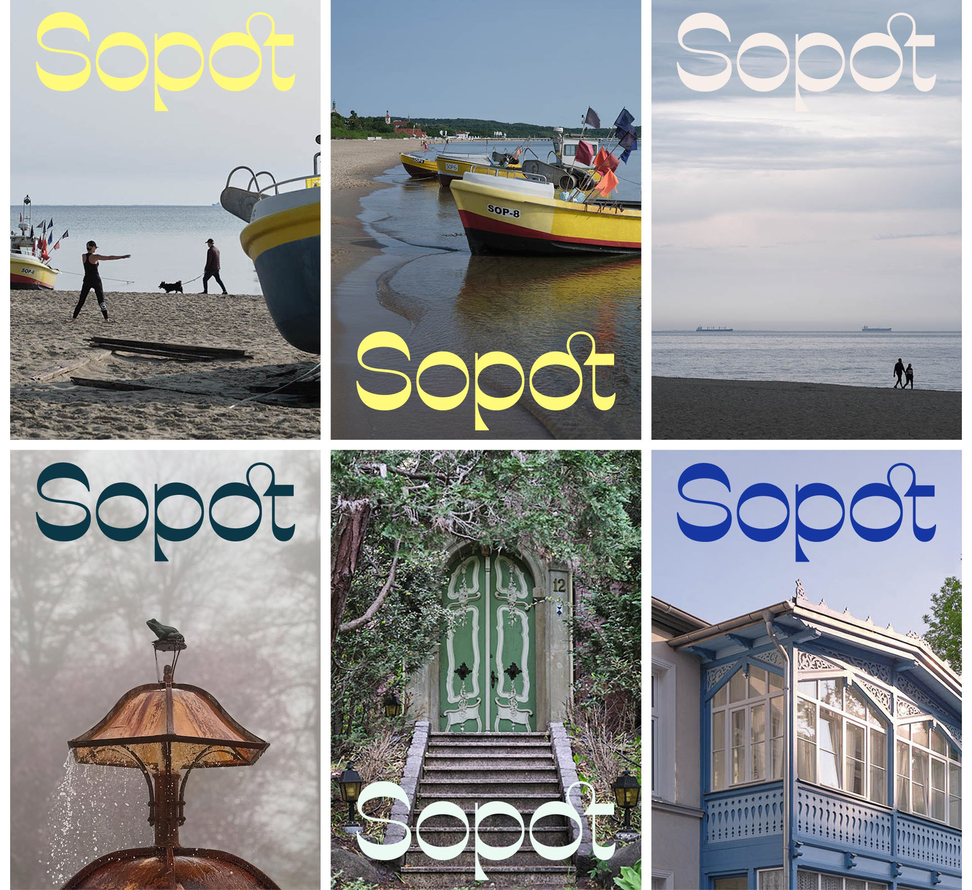
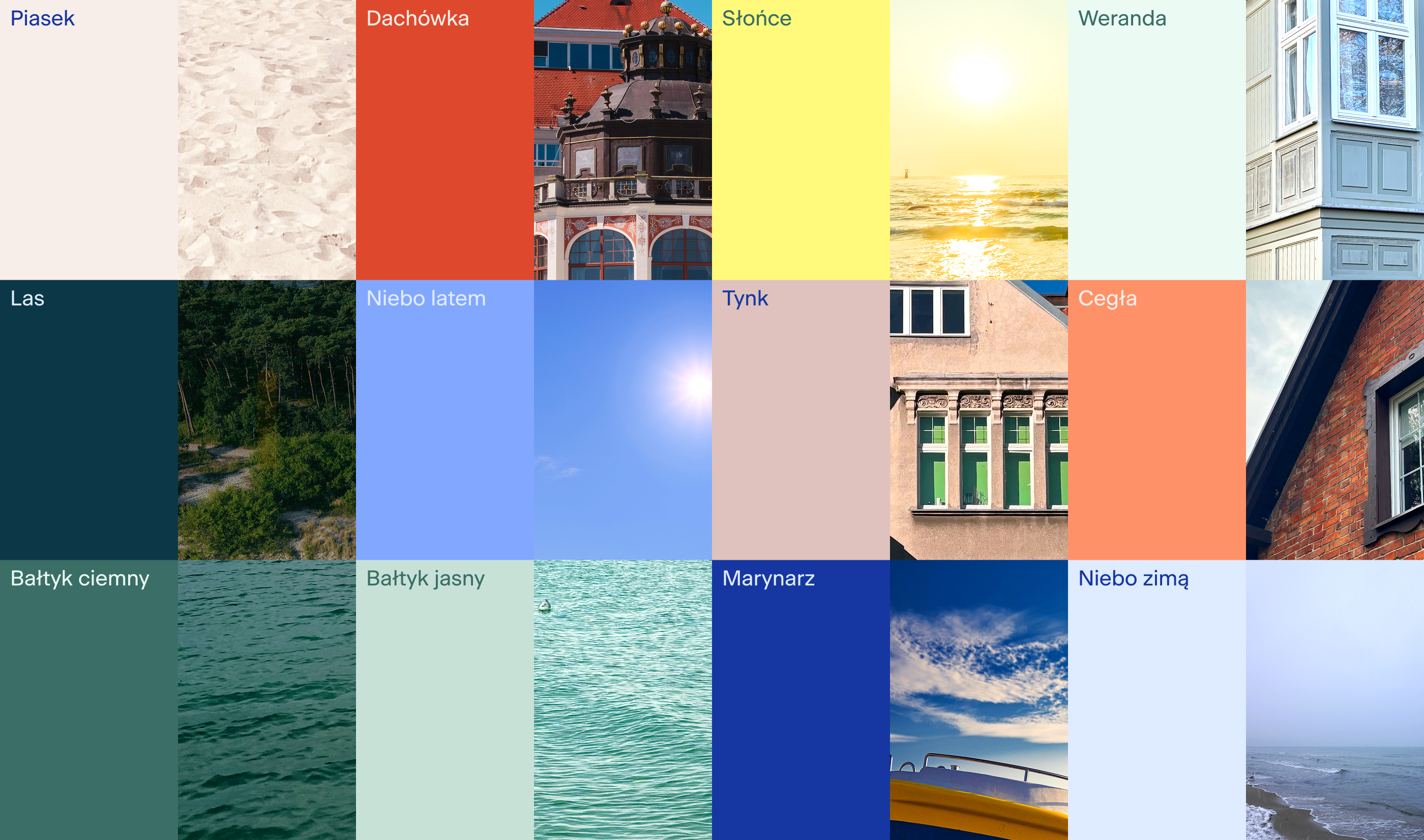
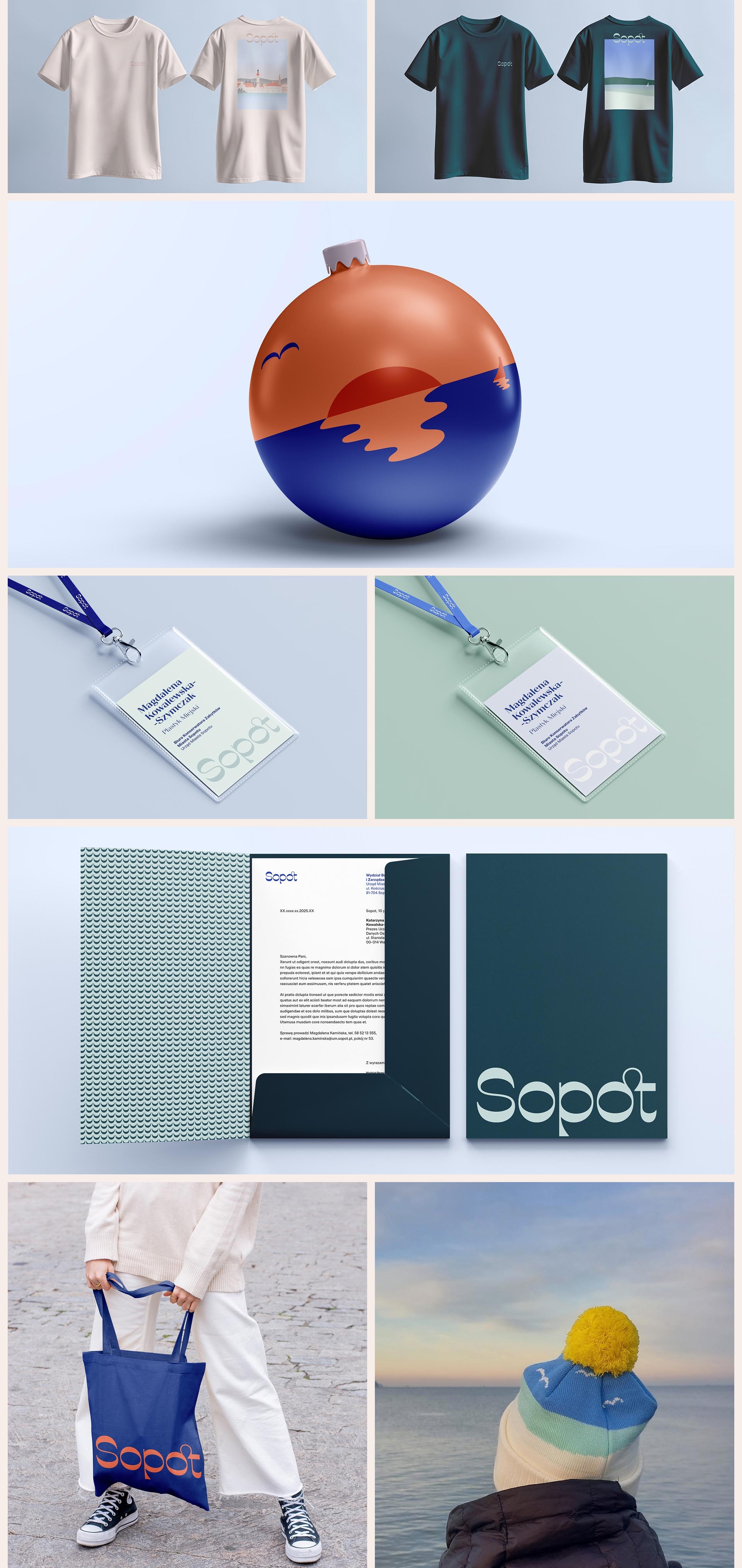
Color palette
The color palette is based on the Sopot landscape—sandy beige, delicate rosy and celadon of the villas, a deep forest green, the colors of the Baltic Sea (attention: it’s not blue!), the blues of the winter and summer sky. The palette is rooted in the vibes of the city, and is consistent with the existing wayfinding system.
Icon system
A set of custom icons complete the visual language, serving as a natural extension of the branding symbols. All of them have been meticulously drawn, using elements of the Sopot logo and typography.
Visual language
The illustrative style underlines the unique aura of Sopot—its peacefulness and natural beauty throughout the seasons.
Creative Direction
Emilka Bojańczyk, Magda Dobruk / Podpunkt
Team
Strategy & Creative Direction:
Emilka Bojańczyk, Magda Dobruk / Podpunkt
Design & Creative Team:
Emilka Bojańczyk, Oliwia Pietrzyk, Diana Makulska, Basia Synak, Ewa Najnigier-Galińska, Aga Drozd / Podpunkt
Type Design & Logo Retouch:
Fatype, Anton Koovit & Yassin Baggar
Photography:
Marcin Czechowicz
City of Sopot
Unsplash (Engin Akyurt, Kateryna Melnyk, Krzysztof Kowalik, Ludomił Sawicki, Łukasz Szmigiel, Maciej Stępień, Jacek Dyląg, Yevheniia Z)
Pexels (Paweł L)
Client
City of Sopot
Awards

